
How is this for a little less crazy?
[ external image ]
ROS design suggestion
Moderator: Moderator Team
![[ external image ]](http://webpages.charter.net/mariemasters/startexample.jpg)
Question: is the start menu there to provide pointers to commonly used categories of applications, configuration items, recently used documents, etc., or be a dumping ground akin to the 'Quick Launch'-bar for every icon and shortcut which might be used at some point in the future?
I know that I prefer an uncluttered layout, which is why I'm using the Classic Theme in WinXP Pro right now. The new startmenu still fails to make sense to me, except that it's more colorful and shiny, which the average user may like more.
I know that I prefer an uncluttered layout, which is why I'm using the Classic Theme in WinXP Pro right now. The new startmenu still fails to make sense to me, except that it's more colorful and shiny, which the average user may like more.
You tend to stuff too big icons too close to each other.
One of the basic guidelines for visual design is use space. With efficent space usage human eye knows where to focus instead of bouncing back and forth between elements.
Try introducing smaller icons and some space.
Also you have divided the menu in two sections, but for some reason you didn't divide the bottom section. Why? With the horisontal divider it just looks like it's quickly assembled without bothering actually think how they should be positioned. (boxes stuffed inside box)
Couple basic visual design guidelines which helps you to make things "easy for the eye"
A) distinct visual clues
B) efficently use space (and you have to be able to answer why do you use space)
C) create lines with elements (align things clearly)
+Why do you have things like ROS UPDATES (Check for Updates) instead of just Check for Updates? Why do you put the things like specific software name ahead of what it actually does? "Check for Updates" in this occasion is much more efficent.
Same with Add/Remove Software. The question is more important in this occasion. Why would you put specific sofware name in the name instead the actual purpose of the software AND specially replace the very same label that Windows has? Wouldn't user be looking for Add/Remove instead of anonymous software?
You have to be able to put yourself in position of the user when you design GUI's, preferably as first-time user.
Can't provoke anyone? Why bother posting?
-
martinfuchs
- Developer
- Posts: 8
- Joined: Sun May 01, 2005 5:00 pm
- Location: Germany
- Contact:
I had a look at the Zeta LiveCD (the successor of BeOS), and found a good idea as repülacement for the "Recent files" entry:There is basic layout I designed a while ago, displaying the search menu & view:
http://www.tpu.fi/~a5mtikka/varasto/gui ... search.jpg
As the two column start menu seem to create quarrel I created kind of
a hybrid of those two. From top down (- {item name}: {things in the
submenu}):
- Username, Help button
- The list of recent applications used
- My Documents: Recent files, Browse my files
- My Computer: Browse my computer, Printers, Control panel
- Network: Recent, Browse network, My shares, Network settings
- Search: Search, Recent, Advanced
- Run: Run, Recent, Advanced...
- All programs
- Lock and Power off
All this recently used things can be divided into three subsections:
- recent documents -> starts theassociated application and opens the document
- recent folders -> opens the folder in an explorer window
- recent applications -> launches an application out of the recently used applications in the start menu
This way the "recent files" in the start menu would not look that cluttered as in XP.
-
martinfuchs
- Developer
- Posts: 8
- Joined: Sun May 01, 2005 5:00 pm
- Location: Germany
- Contact:
Sure, the modified screen shot looks good. But please tak in mind: This is only the result of using a paint program. The original screen shot looks ugly mostly because of the still missing support for alpha blended icons in ReactOS. This results in this disturbing black borders around the icons. The icons in Explorer look far better if you create the screen shot of ROS Explorer on XP, instead of ReactOS. The icons itself are using 24 bit colors + Alpha channel. But sadly ReactOS can't display them correctly until now. So before trying to replace the current icons with that of Firefox or some other... Be prepared to see similar problems with the current ReactOS graphic engine. If those issues are resolved, even the current icons will look much better in ReactOS!I like it very much!
The explorer look a lot better with the firefox icons. It's a proof that the current explorer icons should be removed ASAP
(of course proprietary icons can't be used...)
Regards,
Martin
This example that i made was to show that simple designs also make a nice interface...
some icons here are copied from other places.
i think thats important to make icons that are in the same line of design...
http://www.de-gratis.com.br/demo/react2.bmp
some icons here are copied from other places.
i think thats important to make icons that are in the same line of design...
http://www.de-gratis.com.br/demo/react2.bmp
Only thing I would change would be the icons used for 'My Computer', 'Trash', drives and maps, as these look a bit 'retro' and don't seem to really fit with the rest of the interface.CerealMax wrote:This example that i made was to show that simple designs also make a nice interface...
some icons here are copied from other places.
i think thats important to make icons that are in the same line of design...
http://www.de-gratis.com.br/demo/react2.bmp
Other than that, you did a great job! I wouldn't mind using such a GUI right now ^_^
Crappish,
I think you forget that 90% of the public want larger icons on the menu, not smaller. Not everyone has the eyes of a developer and tweak their icons for a 2048x1536 display. I could detach the vertical lines and re-arrange the icons a little bit, but these are the elements that I felt were most appropriate for the "quick launch" style of start menu. Quite frankly if I want certain programs a click away then they are going into a floating menu or into the quick launch bar.
I think you forget that 90% of the public want larger icons on the menu, not smaller. Not everyone has the eyes of a developer and tweak their icons for a 2048x1536 display. I could detach the vertical lines and re-arrange the icons a little bit, but these are the elements that I felt were most appropriate for the "quick launch" style of start menu. Quite frankly if I want certain programs a click away then they are going into a floating menu or into the quick launch bar.
*************************************
Go Huskers!
Go Huskers!
Elledan wrote:Only thing I would change would be the icons used for 'My Computer', 'Trash', drives and maps, as these look a bit 'retro' and don't seem to really fit with the rest of the interface.CerealMax wrote:This example that i made was to show that simple designs also make a nice interface...
some icons here are copied from other places.
i think thats important to make icons that are in the same line of design...
http://www.de-gratis.com.br/demo/react2.bmp
Other than that, you did a great job! I wouldn't mind using such a GUI right now ^_^
Elledan, the purpose of the artwork was to show a nice interface with some icons of the same style, different from all the other arts showed that mixes 16color icons, 256color icons, 3D icons, 2D icons.
... and not to suggest that icons to the interface.
and like martinfuchs said before "still missing support for alpha blended icons in ReactOS", so... we cannot suggest to much.
I hope to make a better one the next time.
Good work MadRat
Good improvement. I can live with it. You had the first lot way to much jamed up the first lot have to remember the next time my eyes go ouch it needs space.
Few little things. Clutter remove option. Under Text Explaining what it does creates the look of Clutter. New users yes old users no and it will look better.
Remove all the stuff that is not in bold. Bold is hard on eyes unless its needed most likely remove bold from the text.
Change a few minor things
Ros Updates=Reactos Updates or Check for Updates
Ros Installer=Add/Remove Software
Consider using the windows help boxes ie go over start menu and sit there and it tells you click here to begin. For the discriptions new users can stop the mouse and find out old users never have to see it.
User only need to know what they need to know. If a user is adding and Removing software do they need to know that they about to use the reactos version?
Develepers user short hand. Ie Ros for Reactos don't expect the public to know this.
Note after cluter cleaning the icons could reduce to half size I guess and still work, User Should have control over Icon and Text size. MadRat Broad as able.
Some of my systems have over 500 applications installed on them menu stackup is a big problem. The problems I have is that if I move or double up a memu entry when the program uninstalls I am left with junk.
This issue has to be dealt with some how.
-
cmoibenlepro
- Posts: 483
- Joined: Tue Nov 30, 2004 5:44 pm
- Location: Canada
Well, if you want larger icons you have to make the menu itself bigger so that there is enough space between each element.MadRat wrote:Crappish,
I think you forget that 90% of the public want larger icons on the menu, not smaller. Not everyone has the eyes of a developer and tweak their icons for a 2048x1536 display. I could detach the vertical lines and re-arrange the icons a little bit, but these are the elements that I felt were most appropriate for the "quick launch" style of start menu. Quite frankly if I want certain programs a click away then they are going into a floating menu or into the quick launch bar.
Can't provoke anyone? Why bother posting?
Absolutelly agree. And I hate the Windows-like shell/design !!!CerealMax wrote:This example that i made was to show that simple designs also make a nice interface...
Anyway, i don't wanna be boring, but ReactOS needs a clean&cool design/shell.
Some examples:
1. litestep
2. SharpE
3. *box
4. GeoShell
...and all open sourced.
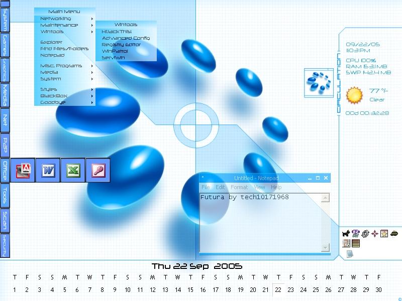
Hey Cereal, check this out !CerealMax wrote:http://www.de-gratis.com.br/demo/react2.bmp
»Forward Agency NPO
In progress we (always) trust.
In progress we (always) trust.
shit!! this is cool a lot... i love BeOS men... BeOS, Zeta, i'm envolved with the tests of them...Patchworks wrote:Absolutelly agree. And I hate the Windows-like shell/design !!!CerealMax wrote:This example that i made was to show that simple designs also make a nice interface...
Anyway, i don't wanna be boring, but ReactOS needs a clean&cool design/shell.
Some examples:
1. litestep
2. SharpE
3. *box
4. GeoShell
...and all open sourced.
Hey Cereal, check this out !CerealMax wrote:http://www.de-gratis.com.br/demo/react2.bmp
BeOS is an example of a good work... i believe that there isn't a easyest GUI for POSIX systems than BeOS.
BeOS is one of some ambients that can be taked as example.
Patchworks, take a look on QNX style
http://www.operating-system.org/betrieb ... bs-qnx.htm
QNX have a lot to teach us.
Who is online
Users browsing this forum: Google [Bot] and 21 guests